Visual
identity
Logo
DownloadThe primary logo is the preferred format for the WD brand. The logo has fixed size relationships when used within the same composition. Do not alter the color, proportions, or alignments of any of the logo elements.
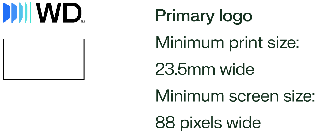
Primary logo

Reverse logo

Logo brand mark

The brand mark logo may be used as a powerful supergraphic across large-scale applications, including environmental graphics, event spaces, and digital experiences. It may also be adapted for compact use cases such as favicons, social media profile images, and other small-format digital touchpoints.
Logo clear space and minimum size
To ensure high visibility and an uncluttered presentation, always maintain clear space around the WD logo. Determine clear space by measuring the width of the “D” letterform in the image mark (see diagram below) and keep a square area equal to this width clear on all sides of the logo. Note that the clear space will change depending on the size of the logo.

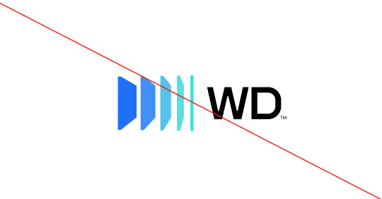
Logo incorrect usage
To maintain the integrity of the brand, avoid manipulating or modifying the WD logo. These examples are select instances of incorrect usage of the logo.


Color palette
DownloadConsistent use of color will help unify all applications of the WD brand. Our color system pays homage to a rich history of blue tones driving our identity, we now shine brilliant blue while also introducing and embracing a fresh sparkling green. Remember to use RGB or Hex values for digital tactics only and CMYK or PMS values for all printed materials.
Primary color palette
- R:255 G:255 B:255
- HEX FFFFFF
- R:0 G:0 B:0
- HEX 000000
- PMS Black 6
- C:60 M:40 Y:40 K:100
- R:0 G:38 B:62
- HEX 00263E
- PMS 2965 C
- C:100 M:39 Y:0 K:76
- R:34 G:102 B:255
- HEX 2266FF
- PMS 285 C
- C:90 M:53 Y:0 K:0
- R:60 G:140 B:255
- HEX 3C8CFF
- PMS 2925 C
- C:69 M:44 Y:0 K:0
- R:64 G:225 B:225
- HEX 40E1E1
- PMS 319 C
- C:56 M:0 Y:20 K:0
- R:72 G:195 B:240
- HEX 48C3F0
- PMS 2995 C
- C:60 M:2 Y:0 K:0
- R:0 G:229 B:209
- HEX 00E5D1
- PMS 3255 C
- C:65 M:0 Y:35 K:0
ADA compliant color combinations
Secondary color palette with tints

- R:255 G:24 B:44
- HEX ff182c
- PMS
- C:0 M:97 Y:86 K:0
- R:255 G:200 B:2050
- HEX ffc8cd
- PMS
- C:0 M:27 Y:9 K:0
- R:180 3 G:0 B:9
- HEX b50009
- PMS
- C:20 M:100 Y:100 K:12
- R:78 G:9 B:24
- HEX 4e0a18
- PMS
- C:42 M:89 Y:71 K:65
- R:128 G:1080 B:225
- HEX 806cff
- PMS
- C:63 M:63 Y:0 K:0
- R:204 G:196 B:2540
- HEX ccc4ff
- PMS
- C:18 M:22 Y:0 K:0
- R:81 G:60 B:217
- HEX 513cd9
- PMS
- C:78 M:78 Y:0 K:0
- R:0 G:3 B:142
- HEX 00048e
- PMS
- C:100 M:97 Y:9 K:9
- R:75 G:150 B:254
- HEX 4b96ff
- PMS PMS
- C:64 M:38 Y:0 K:0
- R:196 G:221 B:225
- HEX c4deff
- PMS
- C:20 M:6 Y:0 K:0
- R:1 G:93 B:241
- HEX 005cf1
- PMS
- C:83 M:65 Y:0 K:0
- R:0 G:41 B:130
- HEX 002983
- PMS
- C:100 M:93 Y:18 K:9
- R:232 G:200 B:74
- HEX e8c849
- PMS
- C:11 M:180 Y:84 K:0
- R:254 G:243 B:197
- HEX fff3c5
- PMS
- C:0 M:2 Y:26 K:0
- R:220 G:176 B:0
- HEX dcb000
- PMS
- C:16 M:29 Y:100 K:0
- R:133 G:117 B:51
- HEX 857533
- PMS
- C:45 M:44 Y:96 K:18
- R:195 G:236 B:76
- HEX c2ed4c
- PMS
- C:28 M:0 Y:86 K:0
- R:231 G:255 B:189
- HEX e7ffbe
- PMS
- C:10 M:0 Y:33 K:0
- R:115 G:212 B:109
- HEX 73d46d
- PMS
- C:55 M:0 Y:77 K:0
- R:3 G:85 B:60
- HEX 03553c
- PMS
- C:90 M:40 Y:81 K:39
- R:228 G:228 B:227
- HEX e4e4e4
- PMS
- C:9 M:7 Y:7 K:0
- R:243 G:243 B:243
- HEX f3f3f3
- PMS
- C:3 M:2 Y:2 K:0
- R:180 G:180 B:180
- HEX b4b4b4
- PMS Black 6
- C:30 M:24 Y:24 K:0
- R:82 G:81 B:82
- HEX 525252
- PMS
- C:64 M:57 Y:56 K:33
Typography
FK Grotesk Neue is an OpenType font, a cross-platform format that provides richer linguistic support through widely expanded character sets and advanced layout features.
Primary fonts
Only use selected weights
Only use selected weights: Regular, or medium

Graphic elements
Below are the core elements that make up the WD graphic system. Refer to the Sample Applications page for guidance on how to use them alone or in combination with other graphic elements.
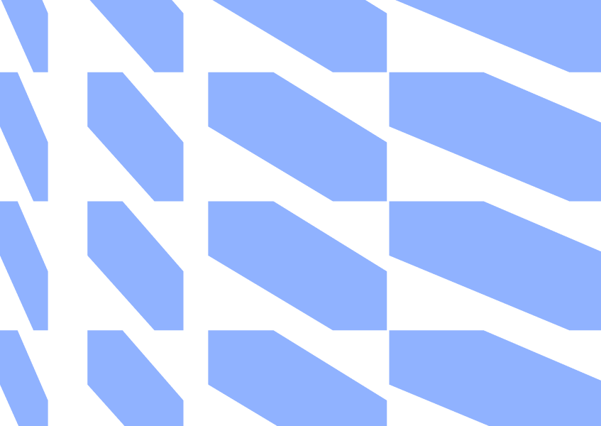
3D glass shapes
The geometric shapes used throughout the brand system are inspired directly by the WD logo and reflect the infinite scalability of our technologies. Their layered, dimensional forms evoke movement, precision, and expansion — reinforcing our ability to perform at massive scale.
Energetic and dynamic, these shapes symbolize forward momentum and continuous innovation. They can flex across applications, from subtle background textures to bold, immersive brand moments, creating a cohesive and unmistakable WD visual presence.


Patterns
Our patters are the 2D extension of our logo racks and are created to provide layering and depth to our layouts. Patterns are to be used primarily as backgrounds with more subtle color application.


Color Application
When applying color to patterns, the goal is to ensure a gentle shift of analogous colors to provide a subtle but noticeable separation.


Gradients
Gradients should be composed of approximately 80% primary brand colors, with spectral accents used sparingly. They should feel like a result of light interacting with edges and planes—not applied arbitrarily. Keep gradients linear or gently curved, avoiding radial or amorphous treatments, with subtle chromatic shifts. Download the complete set of gradient art on the downloads page.


Icon library
WD has an extensive icon library for use in most applications. Should you need a custom icon or icons set for a specific use case, contact corporate brand for assistance.
Photography
A major part of our visual identity are how we show up in photography and video. Below are some keys to keep in mind as we seek to align these elements with our more modern, precision-focused visual identity.
A library of approved photography can be accessed on the downloads page and will be updated periodically as we complete photo and video shoots.
Product photography
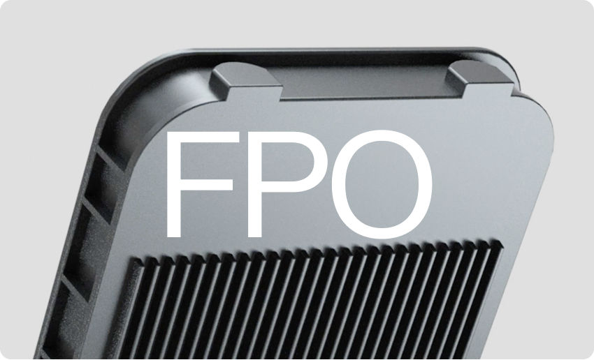
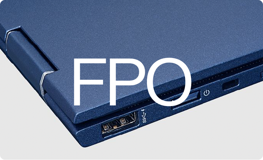
Our approach to product photography is straightforward but still artistic. We’re letting WD’s products speak for themselves — their shapes, details, and design do the heavy lifting. The shots are clean, considered, and intentional. No props, no gimmicks, no extra clutter — just the product. We’re focused on things like form, composition, texture, and surface to show off the quality of the materials and how well the products are made.
No labels
To focus on the engineering and surface textures of each product, we need to shoot without any labels or product-specific details whenever possible. Our goal is to create a series of images that elevate the storage products to something of beauty and grace.
Unique angles
Push to capture something unexpected — angles, perspectives, and orientations that feel specific to the product and a little surprising. Don’t just default to the obvious shot.
Consistency
But it’s not just about making beautiful individual images. Consistency matters just as much. The goal is a look and feel that holds together across the entire product line, so that even the most straightforward shots feel cohesive and polished. Every image should feel like it belongs to the same family — and every image should look great.
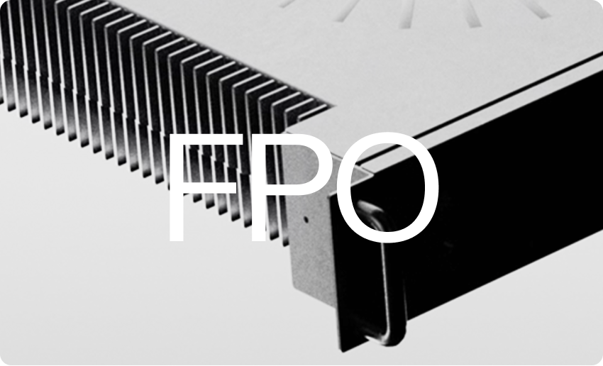
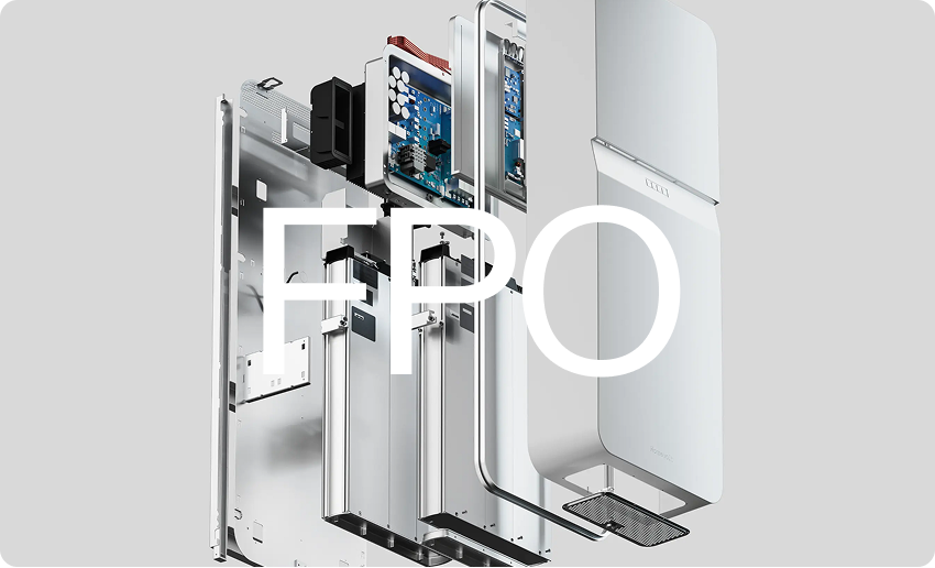
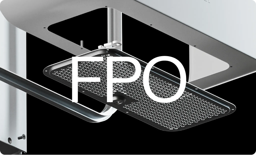
Exploded Views
To augment our product images, we will also be creating a series of exploded views to highlight the precision engineering and attention to detail found in every WD product.
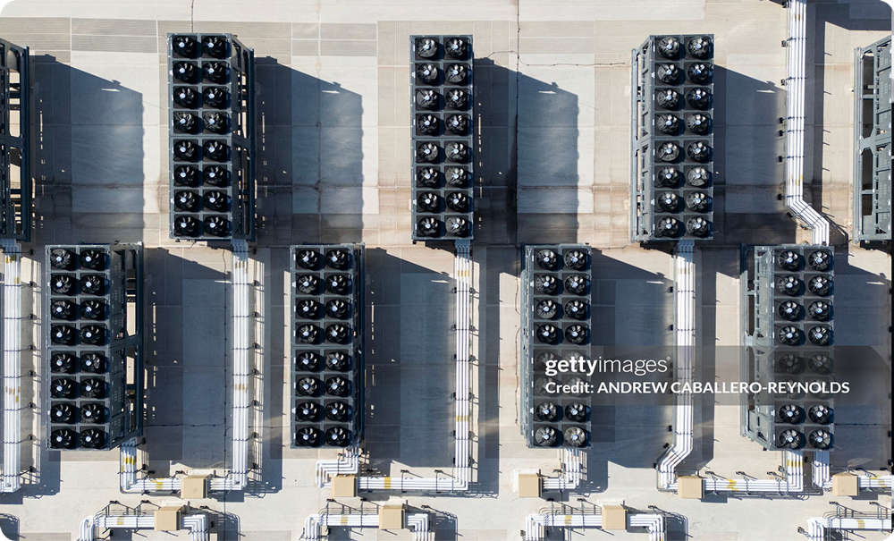
Environmental photography
Environmental images are created to reinforce our role in the data center. Locations should be ultra-modern, clear of clutter and any unnecessary objects. Shoot for either light or dark overall palettes and avoid affecting color to maintain the authentic and technical feel of our photography. We prefer to keep everything in focus, allowing for variable crops.
Composition
It is important to shoot a mix of centered and asymmetrical shoots of your subject to generate options that accommodate a variety of layouts. Shots can be set up both close and wide and from varying perspectives (eye-level, low-angle, high-angle/top down).
People
In environmental photography, people can play supporting role. People can be shown actively or passively interacting with product, as long as they aren’t the focal point of the image. This can be accomplished through scale (keeping people small in the crop), positioning, motion blur, etc…


Human photography
Use a documentary/editorial photography style that is journalistic in nature. These images capture our people and their personal experiences every day at WD. Highlight them as unique individuals, and feature them in positions of expertise, proficiency and focus.
Technical style
The lighting should feel natural, not artificial. In keeping with that journalistic style we prefer a greater depth of field with more of the image in focus and limiting the use of a telephoto lens as the story is more successfully communicated with more in the frame. We prefer shots that have everything in focus. Documentary-style street photography is often shot at 35mm and 50mm lens fixed focal lengths. Use this as a starting point but don’t use it as a rule or a crutch.


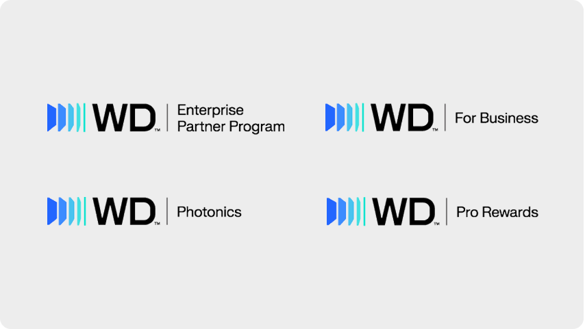
Sub brands
Download TemplateSub brands can be created when required for individual divisions, business units or partnerships. Please use the attached template to ensure proper scale and alignment.